Google advice: Switch to responsive before the mobile-first index rollout
Google has said that its mobile-first index may not have a single launch day - and that means the quicker you become responsive the better.

In November 2016, Google announced their mobile-first index initiative. Since then Google has been working out issues with launching the new mobile-first index and although it might be some time before it goes live, Google has urged users to convert their mobi-sites to responsive before it happens.
The rationale is that right now, Google has a desktop-first index.
Currently, Google doesn’t really index your m-dot (mobi-site); they just annotate the m-dot URLs, but there is no true indexing of your m-dot content. So if you did a migration from m-dot to your main www now, Google doesn’t have to index anything, it just updates those mobile annotations to say the main website is mobile-friendly because it is responsive.
If you wait to do this after the mobile-friendly index rollout, then Google will fully index your m-dot content and URLs. Then the migration will take longer, because Google is not just updating URLs but also the content and signals within your pages. In short, it might make sense for you to push up your m-dot migration plans now versus waiting.
Mobile content should be equivalent to your desktop content
Many user experience experts say it is okay to show less content and fewer features on your mobile version of your website. However, having less content on your mobile site than you have on your desktop site may result in ranking changes when the mobile-first index goes live.
Google’s John Mueller said on Twitter that “mobile pages should be fully equivalent in content & functionality regardless of indexing.” “Why wait to fix that?” he added. Mueller’s logic is that your users want the same level of experience, so figure out a way to have it in a user-friendly way without removing any content or functionality. It will not just help with giving users what they want, but also with indexing when the new mobile-first index rolls out, he said.
So what can you do?
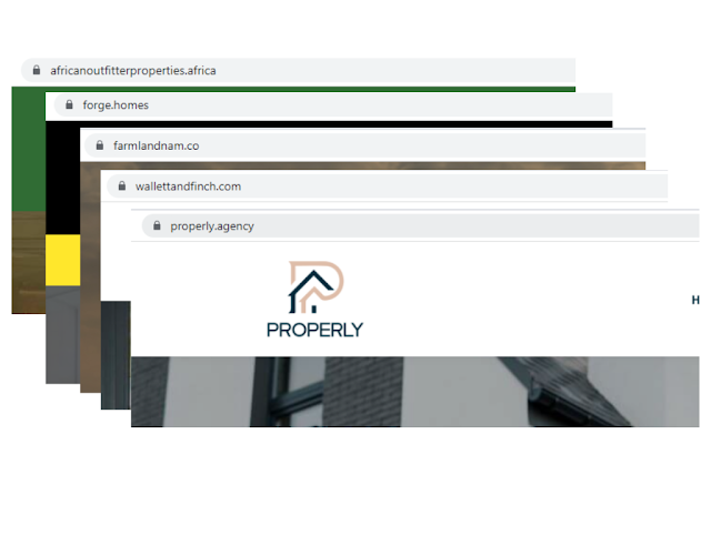
To ensure you are ready for the change, you can upgrade your current Entegral powered website to our fully responsive, SEO Flex real estate website.
Flex powered websites adapts to the device it is viewed from, without losing functionality - this means that whether a visitor is viewing your site from their laptop or smartphone they still get the full experience - from searching for properties to reading your latest news.
And as a side-note with 46% of people questioned by Stanford’s Persuasive Technology Lab saying that a website’s design is the number one criterion for discerning credibility can you afford to wait longer before making the switch?
Contact us today to find out more about upgrading your old Entegral website to a Flex website or for more information on launching your first real estate website with us.

In November 2016, Google announced their mobile-first index initiative. Since then Google has been working out issues with launching the new mobile-first index and although it might be some time before it goes live, Google has urged users to convert their mobi-sites to responsive before it happens.
The rationale is that right now, Google has a desktop-first index.
Currently, Google doesn’t really index your m-dot (mobi-site); they just annotate the m-dot URLs, but there is no true indexing of your m-dot content. So if you did a migration from m-dot to your main www now, Google doesn’t have to index anything, it just updates those mobile annotations to say the main website is mobile-friendly because it is responsive.
If you wait to do this after the mobile-friendly index rollout, then Google will fully index your m-dot content and URLs. Then the migration will take longer, because Google is not just updating URLs but also the content and signals within your pages. In short, it might make sense for you to push up your m-dot migration plans now versus waiting.
Mobile content should be equivalent to your desktop content
Many user experience experts say it is okay to show less content and fewer features on your mobile version of your website. However, having less content on your mobile site than you have on your desktop site may result in ranking changes when the mobile-first index goes live.
Google’s John Mueller said on Twitter that “mobile pages should be fully equivalent in content & functionality regardless of indexing.” “Why wait to fix that?” he added. Mueller’s logic is that your users want the same level of experience, so figure out a way to have it in a user-friendly way without removing any content or functionality. It will not just help with giving users what they want, but also with indexing when the new mobile-first index rolls out, he said.
So what can you do?
To ensure you are ready for the change, you can upgrade your current Entegral powered website to our fully responsive, SEO Flex real estate website.
Flex powered websites adapts to the device it is viewed from, without losing functionality - this means that whether a visitor is viewing your site from their laptop or smartphone they still get the full experience - from searching for properties to reading your latest news.
And as a side-note with 46% of people questioned by Stanford’s Persuasive Technology Lab saying that a website’s design is the number one criterion for discerning credibility can you afford to wait longer before making the switch?
Contact us today to find out more about upgrading your old Entegral website to a Flex website or for more information on launching your first real estate website with us.