Simplicity is actually quite complicated
How true is this?
We are currently busy with a complete rebuild of the MyProperty website. There are 3 main areas to focus on: 1) the design 2) the functionality and 3) the overall user experience. We are spending a lot of time on all three and if you follow our #NewMyProperty tweets or Facebook page you can get some sneak peeks on what we’re doing. Some of the best features and design elements we’ll save for last. We have developed some new industry first search functionality and have gone to great lengths to ensure that we improve the overall user experience in order to attract more leads for all our real estate clients.

“…Simplicity is often equated with minimalism. Yet true simplicity is so much more than just the absence of clutter or the removal of decoration. It’s about offering up the right things, in the right place, right when you need them. It’s about bringing order to complexity. And it’s about making something that always seems to “just work.” When you pick something up for the first time and already know how to do the things you want to do, that’s simplicity…” ~ Apple
Each page is designed and reworked over the course of a week or two. We’ve done all the key pages now and they look great. The new site is colourful which made the design process a bit more complicated – how do you implement this without overpowering the user and prevent it looking like a hotdog stand?
At the same time you have to look at the overall user experience: we constantly ask ourselves how we can make property search & viewing properties simpler for the end user? You end up taking stuff out, and add some new things – it is a constant back-and-forth process. Luckily it is work we enjoy, a very creative process that brings out the best in us including design and development. The advantage we have is that we can also take years of experience, and data we’ve collected on the current site, to see what works and what doesn’t. Google Analytics is priceless assisting with this. Plus once the new website is up, we will be able to measure & compare conversion rates against the old website.
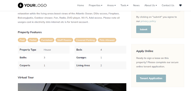
We’ve increased the photo sizes on properties (30% larger compared to other portals) and one of the challenges is to see how we can best capitalize on this and enhance the viewing experience for the potential buyer:

MyProperty’s logo also came under scrutiny. Do you design something complete new or just rework the current one?
A trip down memory lane, this is what our logo looked like in 2005…ouch! (not really a logo)
Moving on one year later in 2006 we came up wit this (notice how we kept the orange MY the same) – a bit better?

2008 and we introduced the search icon on the MY:

And through several other smaller refinements this is what it looks like today (2013):

The logo basically went from very simple to more complex, and the back to simple again. Jury still out but for now decided to only do a tweak on the current logo. Simplicity is complicated.
Few things in business are more rewarding than working on your own products and services and improving them with a great team. Since we are a completely independent company we have lots of freedom and our whole team enjoys this. Implementing your company core values and vision into this is highly rewarding. Working to make property search simpler is our goal with the #NewMyProperty.