Responsive website design - Statistics that prove you cannot wait anymore
Mobile traffic is not new and in years gone by a mobile version of a desktop website would have been enough, however, in the age of smartphones, tablets and an agile society that wants information right now responsive design is the only way forward.

You can argue that a mobi-site is suffice for your business but you would be wrong. Not only is responsive design a key element in a strong SEO strategy, it is also a deciding factor for many consumers on whether or not they will make use of your services.
Here are the latest statistics that prove that you can no longer wait to switch your site over to a responsive website:

As mentioned before - mobile traffic is not new, in fact Statista has found that it has been ahead since 2015, however with the technology behind smartphones improving turning mobile phones into mini laptops and the increase in mobile traffic, websites that aren’t responsive are losing progressively larger portions of their audience each year.

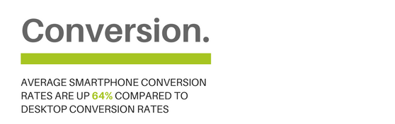
The projection for mobile internet usage is 79% by the end of the year - even Apple, a company that started out building computers - are foreshadowing the end of the computer with ads for the iPad Pro.
We’ll admit that the subject in the ad might be too young to buy a house - but aren’t we all using tablets and smartphones in our daily lives? Why wouldn’t you want your website in front of those with the buying power?

Before you think that it is all about algorithms and search engines, word of mouth shows you yet again that what people think about you matters. People still talk in the mobile age and they still want recommendations from friends, family or colleagues.
Don’t think your mobi-site is poorly designed? It might not have been but for a smartphone user your outdated mobi-site does not provide optimal user experience and if they don’t like their time on your site why would they recommend it or even use your services?

All the traffic in the world doesn’t matter if a website isn’t ready to give that traffic what it’s looking for.
A website that requires pinching and zooming is no longer just a small inconvenience to its users, it’s an automatic “no.” While responsive design is not yet featured on as many websites as it should be, it’s still out there—and users will search until they find it rather than settling for a bad website.

Here is the thing a user reading your article on the property market in Johannesburg from his laptop while at home, wants to pick-up his smartphone and continue to read the article on the Gautrain on his way to a business meeting without any hassles or confusion.
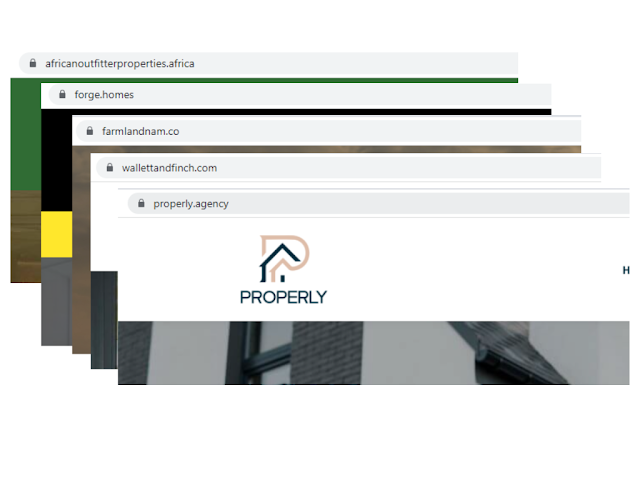
A mobi-site will not able be to provide that. Responsive design means that the page has adjusted to the screen size of the device it is viewed from without losing functionality and design aesthetic.
This means that the companies using responsive design are reaping the benefits of providing a seamless experience to their clients. Why? Well, John can enquire about a home that he found on the agency website after reading their article about the property market in Johannesburg by simply sending an email to the agent right from the listing page.
People want ease, they want simple - they want responsive. So why not give them what they want and boost your business?
Contact us today to enquire about our industry-leading Flex responsive real estate website product that will change the way you do business online.
You can argue that a mobi-site is suffice for your business but you would be wrong. Not only is responsive design a key element in a strong SEO strategy, it is also a deciding factor for many consumers on whether or not they will make use of your services.
Here are the latest statistics that prove that you can no longer wait to switch your site over to a responsive website:

As mentioned before - mobile traffic is not new, in fact Statista has found that it has been ahead since 2015, however with the technology behind smartphones improving turning mobile phones into mini laptops and the increase in mobile traffic, websites that aren’t responsive are losing progressively larger portions of their audience each year.

The projection for mobile internet usage is 79% by the end of the year - even Apple, a company that started out building computers - are foreshadowing the end of the computer with ads for the iPad Pro.
We’ll admit that the subject in the ad might be too young to buy a house - but aren’t we all using tablets and smartphones in our daily lives? Why wouldn’t you want your website in front of those with the buying power?

Before you think that it is all about algorithms and search engines, word of mouth shows you yet again that what people think about you matters. People still talk in the mobile age and they still want recommendations from friends, family or colleagues.
Don’t think your mobi-site is poorly designed? It might not have been but for a smartphone user your outdated mobi-site does not provide optimal user experience and if they don’t like their time on your site why would they recommend it or even use your services?

All the traffic in the world doesn’t matter if a website isn’t ready to give that traffic what it’s looking for.
A website that requires pinching and zooming is no longer just a small inconvenience to its users, it’s an automatic “no.” While responsive design is not yet featured on as many websites as it should be, it’s still out there—and users will search until they find it rather than settling for a bad website.

Here is the thing a user reading your article on the property market in Johannesburg from his laptop while at home, wants to pick-up his smartphone and continue to read the article on the Gautrain on his way to a business meeting without any hassles or confusion.
A mobi-site will not able be to provide that. Responsive design means that the page has adjusted to the screen size of the device it is viewed from without losing functionality and design aesthetic.

This means that the companies using responsive design are reaping the benefits of providing a seamless experience to their clients. Why? Well, John can enquire about a home that he found on the agency website after reading their article about the property market in Johannesburg by simply sending an email to the agent right from the listing page.
People want ease, they want simple - they want responsive. So why not give them what they want and boost your business?
Contact us today to enquire about our industry-leading Flex responsive real estate website product that will change the way you do business online.